
When a brand launches a new collection, customers need to see the same story everywhere they look. The social posts, the website hero takeover, the email and the retail store signage all have to match. If one channel feels off, the campaign loses momentum and shoppers start to question what they’re seeing. That’s why a well-planned retail signage rollout matters so much for multi-site retailers.
Swatch tapped 40 VISUALS to produce the in-store graphics for its Painted Paradise campaign, and we rolled the program out across 25+ locations, including three of the brand’s NYC locations: SoHo at 132 Spring Street, Times Square at 1535 Broadway and the World Trade Center store at 185 Greenwich Street. Each store got a mix of retail signage displays, including window displays, SEG fabric graphics, adhesive vinyl and large format prints, so the campaign felt consistent from the sidewalk to the back wall.
About the Swatch Painted Paradise Campaign
Painted Paradise is a set of four ultra-thin SKIN watches built around a tropical theme: Paradise Petals, Paradise Mist, Paradise Canopy and Paradise Bloom. The visual identity leans on bright floral artwork and painted hand tropical characters. You can see the full collection on the Swatch Painted Paradise page. Our job was to take that artwork and translate it into retail store signage that holds up at every size, from a pedestal topper to an exterior brick wrap.


Strong storefront visuals for Swatch’s Painted Paradise rollout carry through to the rest of the store for a cohesive look.
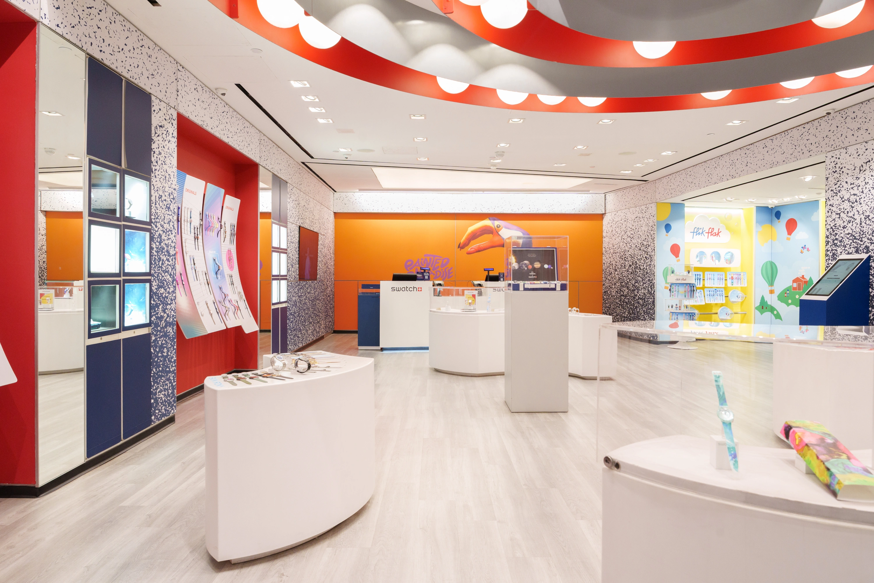
Retail Store Signage at the Swatch SoHo Store
The SoHo store at 132 Spring St got outfitted with a variety of different signage displays. On the exterior below the window, we produced a 12′ x 2.5′ brick wrap with a black background and bright floral artwork that gives the building a pop of color from down the block. The window itself got an 8′ x 3.5′ application of TwoWay Vision and Ultra Clear Ice film so street traffic can see in while the graphic still reads from the street.
Inside the window display, two large backlit SEG fabric lightboxes carry the campaign. One is a 38″ x 79″ floral graphic and the other is a 42″ x 54″ painted hand toucan wearing a Swatch watch with the Painted Paradise logo. Further into the store, a 63″ x 144″ SEG lightbox features a painted hand flamingo wearing a Swatch.
For product display, we produced 15″ x 15″ adhesive vinyl circles that sit on top of pedestals, with artwork matching the watch on display. The display column was wrapped with banner film. Throughout the store, display panels of assorted sizes use adhesive vinyl film with microsphere technology, finished with varnish gloss effects from our swissQprint Kudu to give the artwork texture and depth. Large video displays run the Painted Paradise motion graphics, and over in the Mission to Earthphase section, you’ll find SEG fabric and adhesive vinyl carrying that campaign.


Intricate details and bold visuals in Swatch’s Painted Paradise window display take advantage of the high foot traffic in Times Square.
Window Signage and Retail Design at the Swatch Times Square Store
The Times Square store at 1535 Broadway gets heavy foot traffic, so window signage had to grab attention fast. We produced a 20.5′ x 11.5′ yellow floor graphic for the window display and a 7′ x 10′ styrene print covering the west wall of that display area. A 3.5′ x 7′ sintra substrate covers a freestanding video display that runs the Painted Paradise motion graphics, and a large panoramic video display runs the same content at scale.
Inside the window display, the 15″ x 15″ adhesive vinyl circles top the product pedestals, with banner film wrapping the columns. Acrylic prints with the campaign graphics add another layer to the visual merchandising, and the same microsphere adhesive vinyl with varnish gloss effects from the swissQprint Kudu carries through on display panels.


Swatch’s World Trade Center store signage is cohesive with the graphic design for the Painted Paradise collection.
Retail Signage at the Swatch World Trade Center Store
The World Trade Center store at 185 Greenwich Street has a massive 20′ x 8′ non lit SEG fabric wall made from 11 panels that come together to form a panoramic graphic of the painted hand toucan with the matching watch. Building it in 11 SEG fabric frames lets the store swap out the graphic later for the next campaign without touching the wall itself, which is the whole point of interchangeable signage.
A 5′ x 7′ duratran transparency print of the flamingo artwork adds a backlit moment elsewhere in the store. Acrylic prints with campaign graphics round out the merchandising, and the same microsphere adhesive vinyl with varnish gloss effects from the swissQprint Kudu ties this store to the other two.
How to Manage a Successful Multi-Site Retail Signage Rollout
Rolling out store signage to dozens of locations at once takes planning. You’re juggling production schedules, install windows, local permitting and the reality that every store has different walls, windows and fixtures. A few things make the difference. Build one master artwork file per asset and scale from there so your retail design stays consistent. Our 40 VISUALS graphic designers can resize your working artwork file for multiple sizes, so stores with different-sized signage displays all look consistent, no matter the retail store design. Map every sign to a specific location before production starts so nothing ships to the wrong address. Use interchangeable signage like SEG fabric frames and lightbox systems wherever you can so the next campaign is a graphic swap, not a full rebuild. And get a partner who handles both production and install so you’re not chasing two vendors. For more on this, read our full guide on how to manage a multi site signage rollout.
Wrapping Up the Swatch Painted Paradise Rollout
The Painted Paradise rollout at SoHo, Times Square and World Trade Center and beyond shows what retail store signage can do when the production, materials and install all line up. SEG fabric lightboxes, adhesive vinyl with microsphere film, window signage, acrylic prints and large format video displays each played a role, and together they gave Swatch a campaign that reads the same no matter which store you walk into. If you’re planning a multi-store rollout of your own, get in touch with 40 VISUALS and we’ll get started helping you produce and install it.


