
Swatch has spent over four decades making watches that stand out. Since 1983, the Swiss brand has built a reputation for bold colors and pop culture moments other watchmakers stay away from. That same energy needs to show up the moment a customer walks into a Swatch store too. Retail signage carries more weight than ever in the decision to stop, look and buy. Stores should be immersive, dynamic environments that keep shoppers engaged. A storefront that looks the same as it did years ago gets ignored. Swatch’s Destination NYC campaign gave 40 VISUALS a chance to build a shopping environment that matches the pulse of the city outside the door. Here’s how we produced the retail store signage for Swatch’s New York locations, and what it means for your own retail store design.



What Is Swatch’s Destination NYC Campaign?
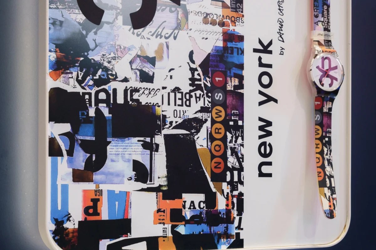
Destination Art is a series Swatch runs city by city, pairing each location with a local artist who reimagines a limited edition watch around that place. For New York, Swatch worked with graphic designer David Carson, known for breaking traditional design rules and reshaping how editorial and brand work looks. Carson built two designs for the watch, one for the front and one for the back, pulling from subway signage, street posters and the textures and colors most people associate with New York. The watch, Carson Time, launched July 16, 2026 at six Swatch locations: Times Square, SoHo, Grand Central Station, World Trade Center, Roosevelt Field and the NYNY Casino store in Las Vegas. Swatch built a full campaign around the launch, not a single window display, which gave 40 VISUALS a chance to build store signage across sites with different footprints. This post covers the Times Square and SoHo locations, the two flagship stores where we produced the deepest retail store signage builds.

The Retail Store Signage We Built for Times Square and SoHo
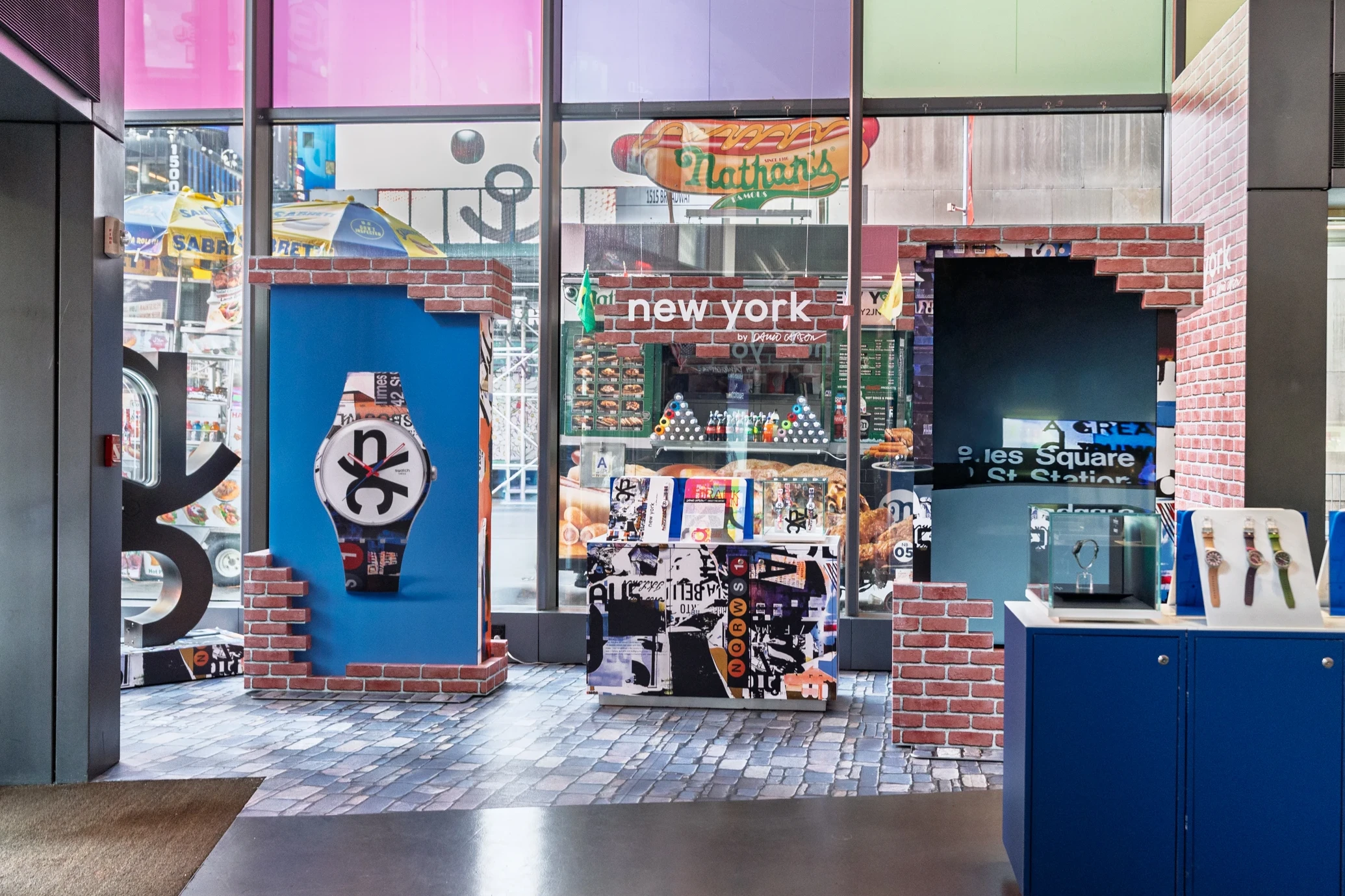
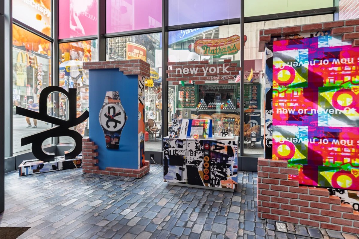
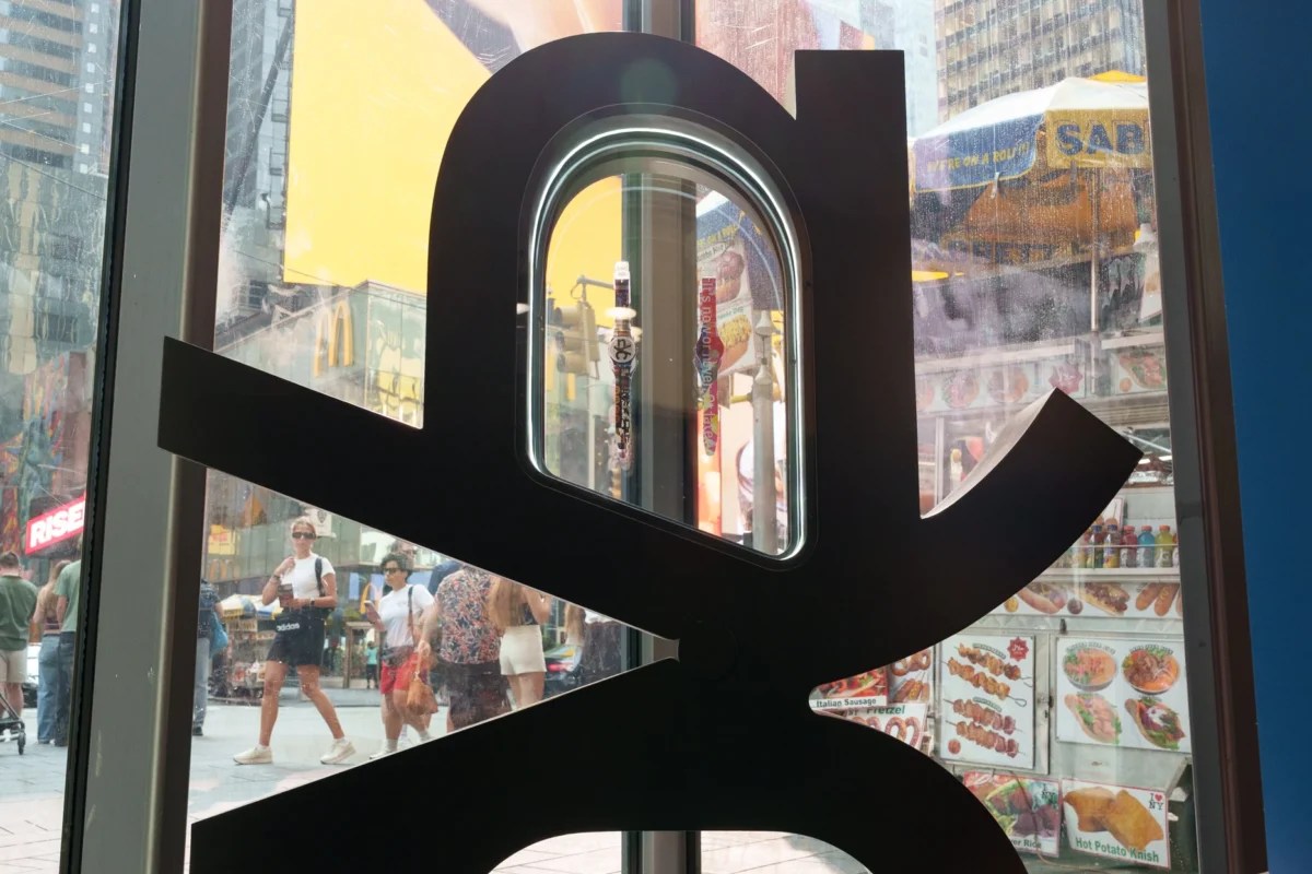
Times Square, at 1535 Broadway, sits on one of the busiest retail blocks in the country, so the front window signage needed to work at a glance. We laminated a 20.5′ x 11.5′ floor graphic into a cobblestone look across the front window, tying the store to the streets outside. A double-sided freestanding TV display sat behind it, faces covered in printed sintra substrate and sides wrapped to match, with 3D ultraboard brick prints wrapping part of the unit and its base finished in the same cobblestone vinyl as the floor. An SEG display carried the same brick and vinyl treatment to keep the floor consistent.
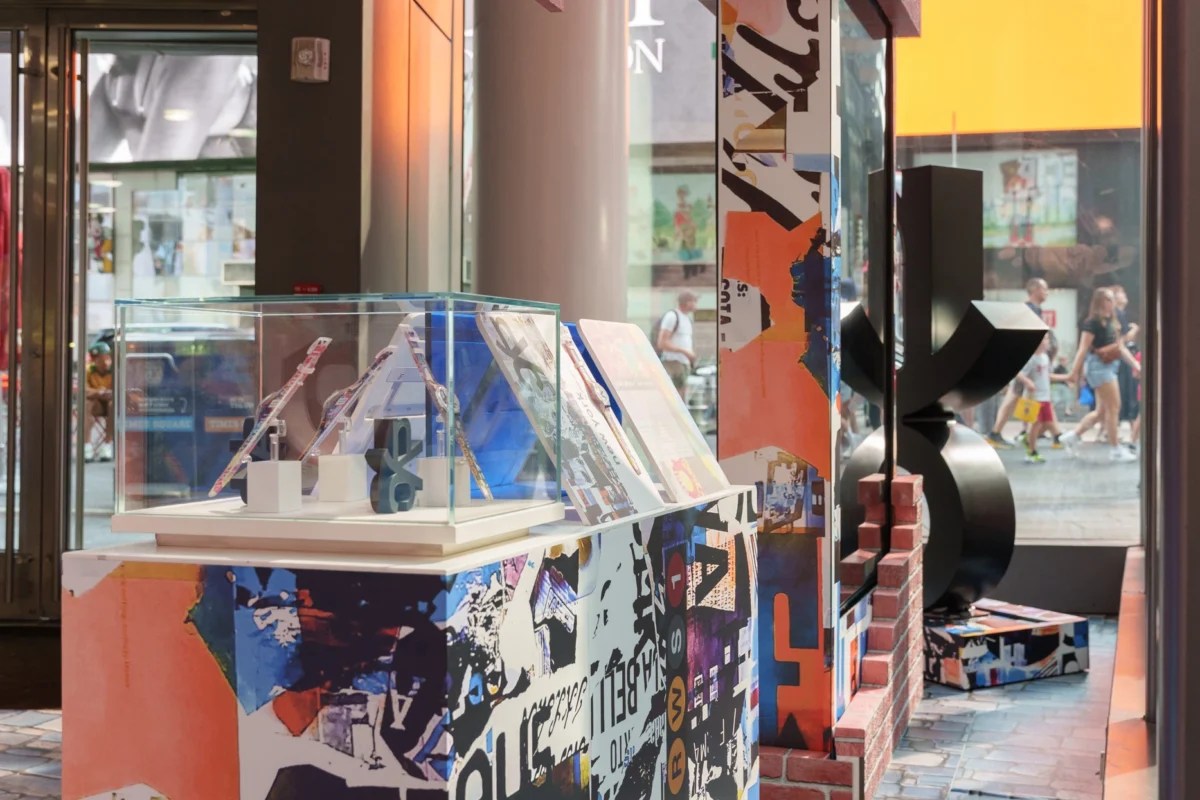
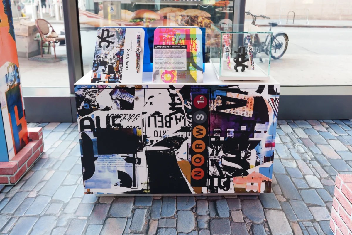
Above the shopper’s head, a ceiling-suspended display wrapped in ultraboard brick framed campaign artwork. The entryway vestibule wall carried an adhesive vinyl brick print with campaign artwork layered on top. Product display stands got adhesive vinyl wraps with smaller vinyl prints behind the watches. In the corner, a black 3D printed sculpture measuring 28.5″ x 34″ spelled out an interlocking NYC logo. A panoramic direct-view LED display near the ceiling toward the back of the store ran the campaign artwork on a loop.
At SoHo, 132 Spring Street, the build leaned more on the storefront itself. A vinyl brick wrap covered the outdoor storefront, with a blockout adhesive vinyl window panel above it matching the same pattern. Inside the front window, two SEG fabric lightboxes lit the campaign artwork day and night. Both stores also shared smaller black 3D printed sculptures inside the product display cases and square styrene printed displays throughout.


Why Visual Merchandising Matters More Than Online Shopping Ever Will
Online stores can show you a watch from six angles and let you read every review before you decide. What they cannot do is put you inside a cobblestone street corner or hand you a store that feels like the city on the box. That’s the gap immersive retail design fills. A shopper who walks past a flat, generic storefront keeps walking. A shopper who sees a wall of 3D-printed sculpture and campaign artwork built into every surface stops and wants to know more. Visual merchandising, done well, turns a store into a reason to visit instead of a place to grab what you already researched online. It gives a good product a stage worth walking into.
Bring This Kind of Retail Store Design to Your Stores
Swatch’s Destination NYC campaign gave 40 VISUALS a chance to turn two flagship stores into full-sized pieces of the city, from cobblestone floor graphics and brick-wrapped displays to 3D printed sculpture and an LED wall running campaign artwork on a loop. Every material choice, from the adhesive vinyl to the SEG lightboxes to the interchangeable signage, needed to work together so the Times Square and SoHo stores felt like one story. That’s what retail store signage does at its best. It turns walking into a store into part of the experience, not an afterthought before checkout. If you’re planning your next campaign, or you want a storefront that stops foot traffic instead of blending into the block, talk to 40 VISUALS about what your retail signage could look like.


